

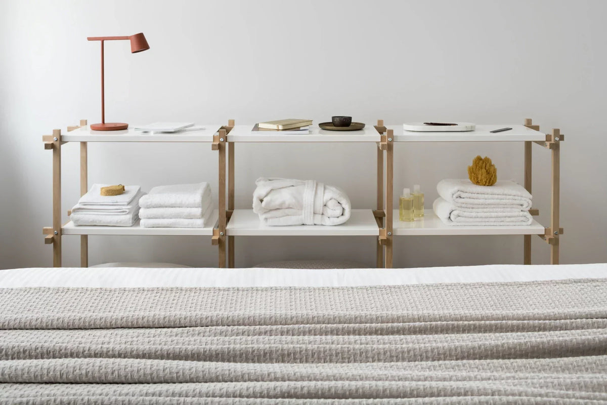
All Lejaan collections are created with sustainability and timelessness in mind. We want our products to look great in every home - and best of all, together.
One of the important steps is the choice of shade, which is handled by our creative director Jana Hučíková. We talked to her about our colour philosophy too.
The dream home
We have had a sophisticated approach to colour from the very beginning. "A harmonious home where everything can be coordinated exactly to your taste has always been our priority. Not least for that reason did we opt for a unified colour palette," notes our creative director Jana, who was there at the very birth of Lejaan.

Grandma's House bedding and brick-red Gentle Organic towel in Pantone shade 18-1343 TPG.
"Many modern apartments and houses have the bathroom next to the bedroom, or directly connected to it," Jana explains the decision behind why seemingly unrelated product lines - bedroom essentials and bathroom terry - coordinate with each other.


Dusty pink Confident Hemp towel and Never Too Late bedding in Pantone shade 14-1803 TPG.
A creative process interwoven with aesthetic and practical vision
"When choosing colours, the main focus is always on the bedding, from which the shade of the terry naturally follows," Jana describes the first steps of her creative process. Even though the colour of products often matches, it may not look that way at first glance. In each product, many other factors influence the final result.


"For towels, functionality is clearly the most important criterion. When expanding collections, I therefore also think about the terry's texture and what we ultimately want from it. For example, for the Playful Cotton collection we chose a lighter weight and a playful stripe, because it is our entry-level collection," Jana emphasises the practical side, which goes hand in hand with the aesthetic. For colour harmony cannot function without the functional.

Light blue Playful Cotton towel and Afternoon Storm bedding in Pantone shade 15-4706 TPG.
The original colour spectrum
We identify all our bedroom and bathroom products by carefully chosen Pantone shades. Each chosen colour carries an idea, a feeling or an experience, from which we draw inspiration and channel it into the communication of individual collections.
Our unique dark blue, for example, transports you to the depths of the ocean, brick red takes you back to holiday moments at grandma's cottage and grey-blue is like a breath of fresh air before a storm.


Midnight Diving bedding and Moody Blue bathrobe in Pantone shade 19-4021 TPG.
How to create a timeless and sustainable interior
The key to a visually appealing home is the interplay of chosen pieces that complement each other perfectly. "Our goal is for customers to be able to furnish their whole home in their favourite colour and to get everything in one place," Jana shares. Choosing the right colour that will not grow old quickly is the core ingredient of timelessness.
Another value we at Lejaan proudly uphold is sustainability. We believe the best path to it lies through conscious purchasing, quality materials and workmanship, and timeless shades. "We are constantly trying to expand our range in terms of both colour and materials, so that truly everyone can find what they are looking for and products become part of homes for as long as possible," Jana adds with a smile.
If you are interested in how to preserve the colour fastness of your products for as long as possible, read our articles on caring for bed linen and terry.


Share:
How to Care for Lejaan Terry
Lejaan Christmas Pop-Up in Prague