

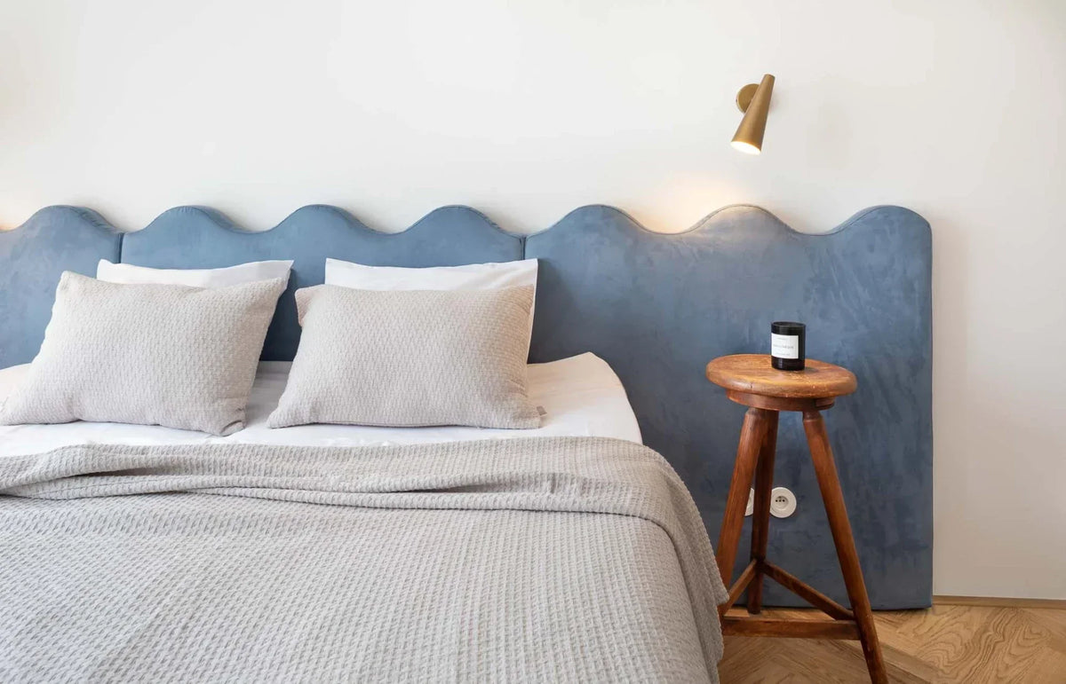
Lightness combined with cosiness, aesthetics interwoven with function. That is how we would define the work of interior designer Martina Šandová from the ti architekti studio, who lets her natural talent, years of skill and her clients' most secret wishes shine through in her projects.
We found out how she thinks about projects, when she realised her fondness for colour, what she believes is the key to a perfectly executed combination of materials, and why exactly she fell for our Mix & Match system.
When did you first realise that buildings were what you wanted to do professionally?
Over time it just sort of happened. I was always drawn to art and, in general, to areas where the right half of the brain does better. At secondary school I studied graphic design, and somehow I moved from 2D to 3D, to working with space and interior design, which I enjoyed and still enjoy today. But when I think about it, it was probably in me since childhood. My parents recently told me again how, when they were teaching me to ride a bike as a little girl, instead of concentrating on riding I kept rating the houses I liked and commenting on the colours of their curtains. (laughs)
Which style is closest to you?
I probably couldn't pick just one. What matters most to me is the final design and whether it is aesthetically coherent and has its artistic or spatial qualities. After that, I don't really mind whether it leans more towards minimalism, eclecticism, extravagance... That's actually the nice thing about this job: different briefs come in, and you can try out several styles in your own personal way.


The house in Malešice features artworks by Michaela Červená, David Krňanský and Richard Konvička.
What do you enjoy most about working together at the ti architekti studio, of which you are an integral part?
Each of us has a slightly different focus - some are more architects or builders, others more detail-oriented. That brings more points of view and often more interesting results.
Together you work on interiors, renovations and new builds. Which projects are your favourites?
We don't do interior decorating alone. We always take on projects as larger wholes, so in fact every interior of ours is a renovation in which we change the layout and the surfaces. So it's hard to say whether I prefer renovations or new builds. Both have their pros and cons. With renovations, magical historical elements can appear, which we then love to preserve, uncover and combine with something contemporary. We enjoy that. At the same time, a lot of unexpected factors can come up, which are more demanding for us to handle.
For the family house in Malešice, which among other things took first place in the Interior of the Year competition, you and your team opted for a fairly massive kitchen island in a striking pink shade. Do you personally like experimenting with colour?
I always thought that "my thing" was rather neutral tones and a limited colour palette, but when I actually look at my projects, they are quite colourful. (laughs) With this particular project, though, it was also one of the client's requirements - he loves colour, so our task was to incorporate it into the design. Using pink for the island came out of the decision to expose the concrete ceiling. The pink contrasts pleasantly with the industrial character of the ceiling, which we wanted to tone down so the space wouldn't feel cold, but fresh and playful instead.


The highlight of the room is the unique pink island, which delights and brings a smile to your face.
You decided to incorporate Lejaan products into this project (and not only this one). Why?
It's not always the rule that we choose bedding or decorations for clients. Some people either have their own or want to take care of these "details" themselves. With this project, I was very glad I could help with choosing textiles too. Specifically, the Tobias' Dream and Never Too Late collections fitted our colour palette wonderfully. Another criterion was the recommendations I had received at the time from relatives and friends, who were thrilled with how pleasant it is.
Where did you first come across Lejaan?
It was about two years ago, when I was looking for a birthday present and was consulting a friend about it. She had just bought the bedding, had been sleeping in it for a week and was full of praise for it. But I had noticed the brand even before that, through Instagram. I remember being struck by its really lovely presentation, photos and graphics.
Which of our collections do you like best?
This will sound like a pre-arranged answer, but actually all of them. Maybe that's exactly why I don't own one myself yet. I keep giving them to everyone or putting them into projects, and I can't decide which bedding to get myself first. (laughs) But it's time to decide, and to start with, it will probably be some neutral colour in organic cotton.


Refresh your interior with bedding that combines unique design with unforgettable quality.
How do you approach materials and combining them?
The chosen combination of materials and colours already creates a certain atmosphere and moves towards a certain style category. So it depends on what I want to achieve. Do I want a masculine luxury style? I'll use, for example, darker wood, leather, nice metal, marble... But I always stick to the rule that one material should be the highlight and shouldn't fight with three others. It's all about sensitively combining textures and colours so that nothing is too much, or too little.
What main advantages do you see in our Mix & Match system, which lets you coordinate collections with one another?
My guilty pleasure is having coffee and something nice in bed. And of course I often spill the coffee and then change the whole bed. (laughs) That's probably not the answer you expected, but for me the big advantage is buying different colours and swapping a stained pillowcase for a grey one instead of a white one without stressing that not everything is tone on tone. At the same time, combining different colours means the bedroom looks a little different every time and the interior gets a new vibe every so often. One time it can be neutral and minimalist, another time more colourful... Like now, with summer arriving.
The family house in Malešice features many rounded shapes, among other things. Is there an intention behind that?
The house is essentially a functionalism-inspired cube with two round windows. We picked up on their shape a little inside the space too. At the same time, curves help make the interior feel more playful and friendly and break up its austerity. For a young, cheerful family with children, it somehow suited us better than strict minimalism and sharp corners.


A fresh and colourful space whose playfulness perfectly reflects its future owners.
Do you prefer it when a client comes with a clear vision, or do you appreciate having a free hand?
I think some boundaries and direction within the brief are always good and help us understand each other with the client and be on the same page... It's certainly not pleasant to work on something where you just redraw someone else's vision and your opinions and ideas aren't heard. Such a collaboration doesn't make sense and doesn't enrich either side.
And how was it with this project?
The collaboration here was very pleasant, and it was one of the projects where we basically had a free hand. Within the possibilities and the budget, of course.
How do you best achieve a cosy space? Can you give our readers some advice?
Already during the design stage, I try to think not only about the layout and technical aspects, but also about where the best place is for cosy nooks, whether a bigger plant will fit into "this" corner, where the future owners will put a small lamp for intimate lighting, whether there's a free wall left for a painting, poster or photo... In my view, all these things make a cosy home, and it doesn't matter whether they're filled straight away or over time. At the same time, we're all different. Personally, I feel best in a space that isn't too cluttered, where I can breathe, but which must not lack flowers, cushions, throws, candles and books.
Do you have a motto or rule that guides you across your projects?
That sometimes it's good to let things settle and rest, and look at them the next day with a clear head.


PRODUCTS FROM THE ARTICLE:
Tobias' Dream illustrated children's bedding
Never Too Late dusty pink children's bedding
Frozen Lake grey and white bedding
Share:
Get Ready for Summer with Lejaan
Visiting PG Foodies